

A Google Calendar color schemes is a system where you assign a consistent color to each category of event, like work, health, or family, so you can understand your day at a glance instead of reading every title. Google gives you 11 default event colors and 24 calendar colors to work with, plus the option to add custom hex codes. Most working schemes use between 4 and 7 colors total. In this guide, I'll show you exactly how to set one up, which colors to pick, and how to avoid the mistakes that make most color-coded calendars fall apart within a month.
Let's get into it.
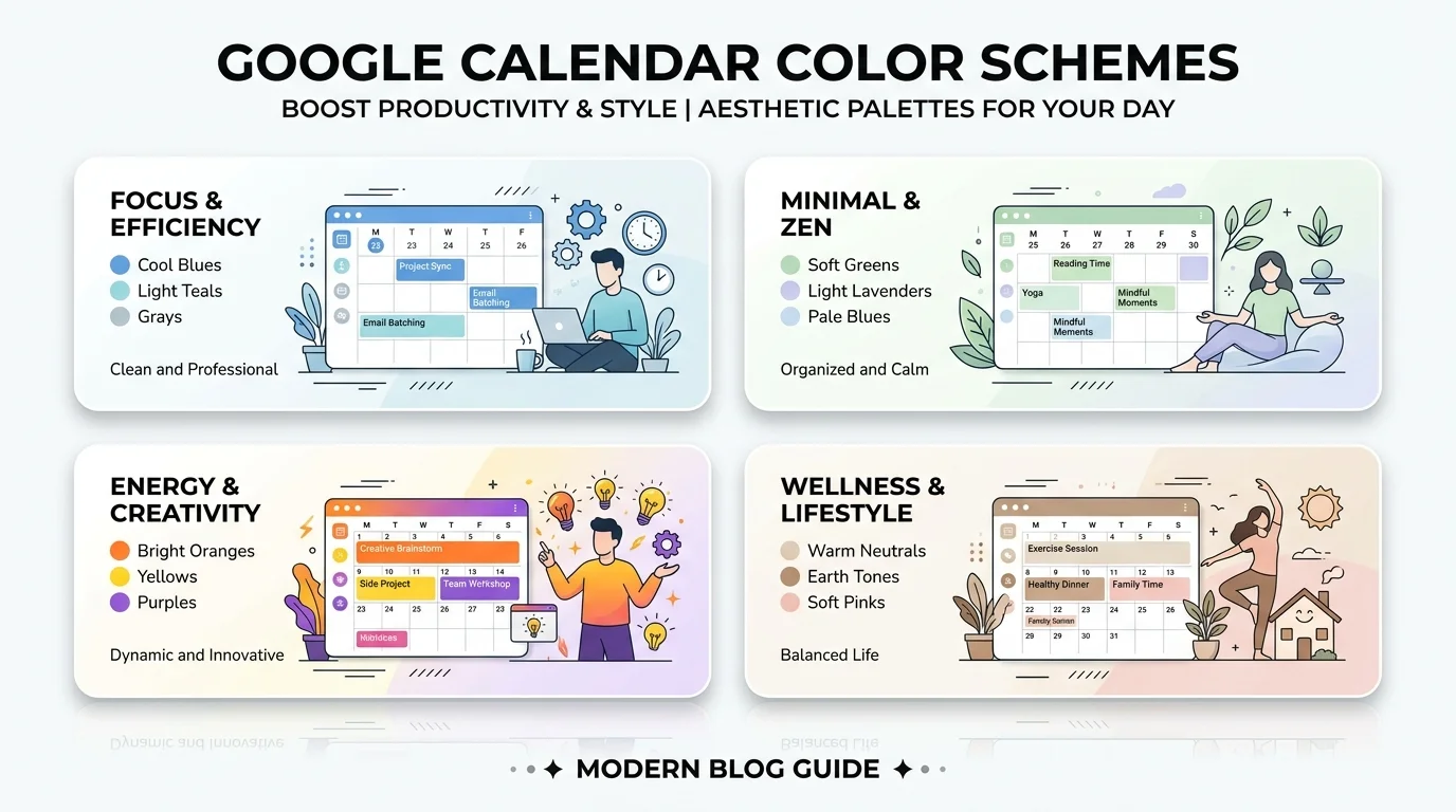
What a Google Calendar Color Scheme Actually Is
A color scheme is just a system.
You assign specific colors to specific types of events, and your brain does the rest.
According to Google's own event color documentation, Google Calendar ships with two color sets you can toggle between: "classic" and "modern." Same names, same IDs, slightly different shades depending on which one you pick.
But here's the part most people miss.
The colors themselves don't mean anything out of the box, as nocal's color code guide points out clearly. Google just gives you 11 labeled options. You're the one who decides that blue means work and green means health.
So really, a "scheme" is a decision you make once and then stick to. If you're still figuring out how you want to structure your week before assigning colors, it helps to map out your categories first using some best productivity Chrome extensions that pair well with calendar planning.
Why Color Coding Actually Changes How You Use Your Calendar
Think about the last time you looked at a packed Tuesday and felt your chest tighten a little.
That's context switching. Jumping between a client call, a gym block, and a family dinner without any visual separation makes your brain work overtime just to categorize what's coming next.
A color-coded calendar removes that step entirely.
Supernormal's breakdown of calendar color psychology makes a good point here: blue tends to read as stable and focused, which is exactly why it works so well for work blocks, while green reads as growth-oriented, making it a natural fit for health-related events like workouts or doctor visits.
You're not just decorating your calendar.
You're giving your brain a shortcut. If you split time between an office and a home office, this kind of visual planning pairs well with the habits covered in our guide on how to work from home.
Google's Default Colors, Compared
Here's every default event color Google gives you, with the hex code and a suggested category. I built this table so you can copy it directly instead of hunting through settings menus.
Color Name | Hex Code | Best Used For |
|---|---|---|
Tomato |
| Urgent, high-priority items |
Flamingo |
| Personal errands |
Tangerine |
| Deadlines |
Banana |
| Family and social commitments |
Sage |
| Health, fitness, wellness |
Basil |
| Deep work blocks |
Peacock |
| Meetings |
Blueberry |
| Core work tasks |
Lavender |
| Low-priority or flexible tasks |
Grape |
| Creative or side projects |
Graphite |
| Reference or admin events |
Data sourced from CalPalette's hex code reference. Keep in mind these are the 11 event colors, which override a single event. There's a separate set of 24 calendar colors, which set the default for an entire calendar and get inherited by every event on it unless you override them individually.
How to Set Up Your Color Scheme, Step by Step
This part takes less time than you'd think.
Step 1: Open your calendar settings. On mobile, tap the three lines in the top left, then tap Settings.
Step 2: Pick a calendar to modify. If you're running separate calendars for work, family, and personal projects, you'll do this once for each one.
Step 3: Tap the color name next to the small color indicator. This opens the color picker.
Step 4: Choose a preset, or go custom. On desktop, click the three-dot menu next to any calendar and add a custom hex color instead of picking from the default 11. This is where you'd plug in a specific shade if you're matching a brand palette or a personal aesthetic.
Step 5: Repeat for every calendar and category. Consistency is the entire game here. If "health green" drifts between three slightly different greens depending on the week, the whole system falls apart.
That last point is worth repeating, because CalPalette's palette guide makes it explicit: the scheme only works if the same hex lands on the same category every single time.
The 4-Category Naming System (My Recommended Starting Point)
Instead of assigning colors to loose ideas like "important" or "fun," I'd point you toward a fixed four-category naming convention: Output (work that produces something), Input (learning, meetings, admin), Body (health, food, movement), and People (family, friends, social). Every event on your calendar fits into exactly one of these four buckets, which forces the kind of consistency that vaguer categories like "priority" tend to break down over time. Assign one color per bucket, keep a fifth color in reserve for genuine emergencies, and resist the urge to add a sixth or seventh category for a while before deciding you actually need one.
How Many Colors You Should Actually Use
More is not better here. I know that feels counterintuitive.
The sweet spot, according to CalPalette's research, is 4 to 7 colors total.
Go below four, and unrelated categories start sharing a color, which defeats the purpose. Go above seven, and you stop remembering what each color actually stands for. At that point you're not glancing at your calendar anymore. You're decoding it.
nocal's guide backs this up with a simpler version of the same rule: three to five meanings are easier to scan than eleven. And if you find yourself manually recoloring half your events every week, that's a sign your default assignments are wrong, not that you need more colors.
Aesthetic Palettes vs. Functional Palettes
There are two very different reasons people search for Google Calendar hex codes.
Some of you want function. You want a system that reduces stress and helps you move through a packed week without losing track of what's next.
Others just want a calendar that looks good.
Both are valid, and you can have both. Gridfiti's collection of themed palettes leans heavily into the aesthetic side, with pastel schemes for calming personal planning, warm autumn tones, and coffee-inspired browns ranging from mocha to chai latte.
If you're building a shared work calendar other people will see, though, I'd steer you toward something closer to CalPalette's "Professional Blue" scheme, which stays inside the blue family Google already uses across Workspace. It reads as native instead of like you went rogue with the color picker.
Common Mistakes That Break a Good Scheme
A few things quietly ruin an otherwise solid setup.
Using too many warm colors. If everything is red or orange, nothing feels urgent anymore, because urgency loses its contrast.
Skipping the "why." Picking colors because they look nice, without tying each one to an actual category, means you'll forget the system within a week.
Never reviewing it. Your categories change. A color that made sense six months ago might not map to anything real in your life right now.
Mixing calendar colors and event colors carelessly. A calendar color is the default, and an event color is the override. If you're not clear on which one you're setting, you'll end up with a mess.
Frequently Asked Questions
How many colors does Google Calendar allow?
Google offers 11 default event colors and 24 calendar colors. You can also add unlimited custom hex codes on desktop.
Can I use a custom hex code in Google Calendar?
Yes. Click the three-dot menu next to a calendar, then use the "+" option to enter any hex code. Custom colors are available for calendars; event-level colors are limited to the 11 presets.
Does Google Calendar's color have a built-in meaning?
No. The 11 named colors carry no inherent category. You assign the meaning yourself, and consistency is what makes the system work.
What's the difference between an event color and a calendar color?
A calendar color is the default applied to every event on that calendar. An event color overrides that default for a single event.
How many colors should I actually use?
Most people do best with 4 to 7. Fewer than four causes overlap between unrelated categories; more than seven becomes hard to remember.
Do event colors sync across devices?
Yes. Colors set through Google Calendar's web, iOS, or Android apps sync across all of them since they're tied to your Google account.
Wrapping This Up
A good Google Calendar color scheme isn't about making your week pretty, although that's a nice bonus.
It's about giving yourself a system you don't have to think about. One glance, and you know what kind of day you're walking into.
Start small. Pick four or five colors using the categories above. Assign them to your real categories, not aspirational ones. Then leave it alone for a month and see how it feels.
You'll know pretty quickly whether it's working.
Read Also: DRAM Light On Motherboard? Fix It Fast 2026