
A serif font is a typeface with small finishing strokes attached to the ends of its letterforms. Those tiny strokes are called serifs, and they are the single feature that separates a serif typeface from a sans-serif font. Serifs trace back to Roman inscriptional carving, moved into printed books in the 1400s, and still dominate newspapers, novels, and luxury branding today. In this guide I'll walk you through the definition, the anatomy, the four main categories, the readability evidence, and how to actually pick one.
What Is a Serif Font, Exactly?
Let me give you the textbook answer first, then the human one.
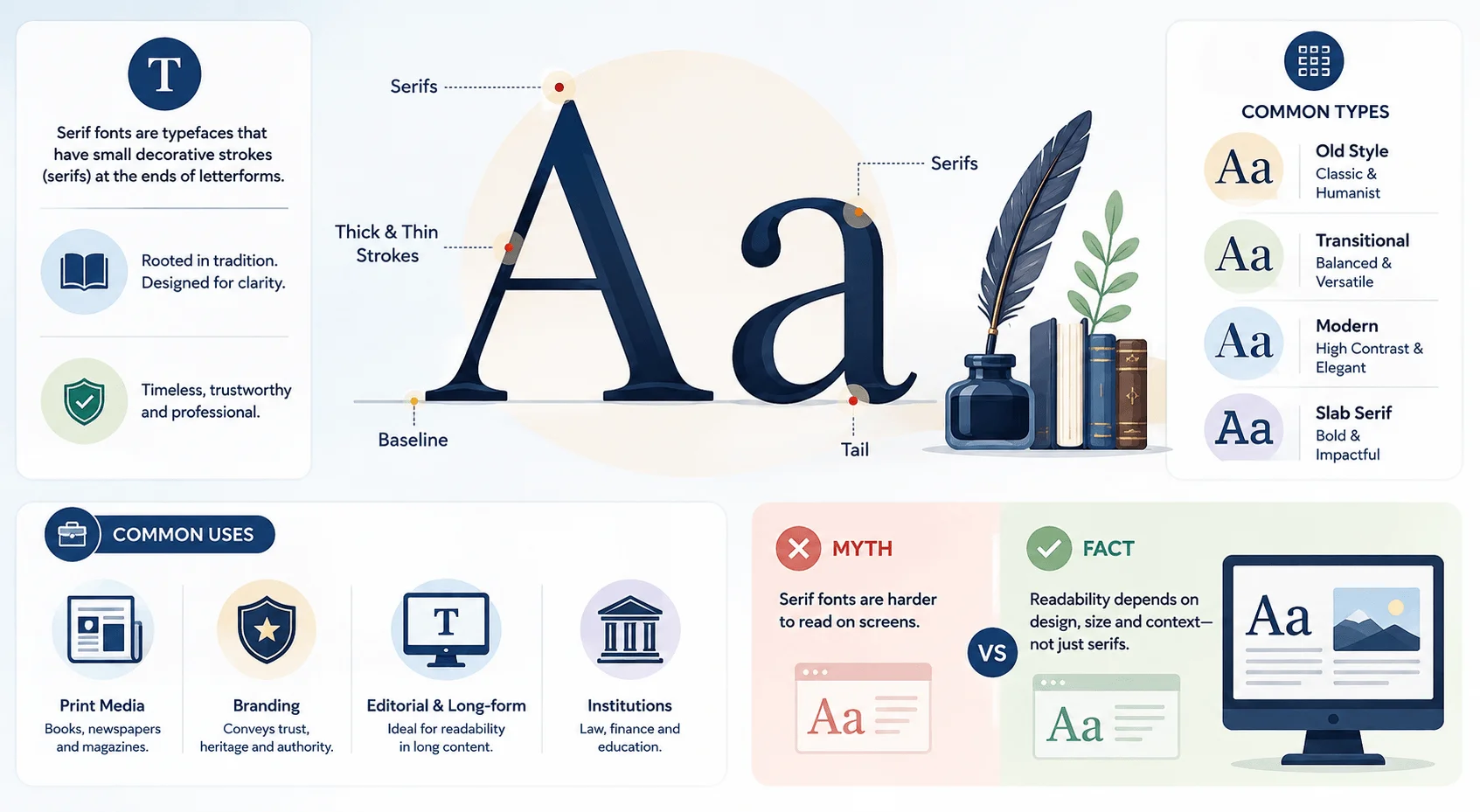
In typography, a serif is a small line or stroke regularly attached to the end of a larger stroke in a letter or symbol. A typeface that uses them is called a serif typeface. One that doesn't is a sans-serif.
That's it. That's the whole distinction.
Now the human version: look at a capital "T" in Times New Roman. See those little feet at the bottom of the vertical stem, and the small flicks at the ends of the horizontal bar? Those are serifs. Delete them and you've got Arial.
Here's a detail most guides skip. In German-language typography, serif faces are called Antiqua, while sans-serif faces get labeled "Grotesk." The Scandinavian equivalent is "Antikva." Worth knowing if you ever license type from a European foundry.
One more thing on vocabulary, because people mix this up constantly: a typeface is the design (Garamond), and a font is a specific instance of it (Garamond Bold, 12pt). In digital work the terms have basically merged, and nobody will fight you over it. If you like this kind of format-versus-format distinction, the same confusion shows up in image files — our breakdown of JPG vs PNG covers that one.
Where Did Serifs Come From? A Short History
The origin story matters more than you'd think, because it explains why serif fonts feel the way they feel to your readers. Two thousand years of association with monuments, scripture, and law books built that perception. You're not choosing a neutral shape when you choose a serif. You're borrowing centuries of accumulated meaning, and your audience picks up on it whether they can name it or not.
Here's the timeline, compressed into a table you can skim.
Year | Development | Key figure |
|---|---|---|
c. AD 113 | Roman square capitals carved at the base of Trajan's Column: thick/thin strokes, angled stress, incised serifs | Roman lapidary masons |
1465 | First proto-roman types printed at Subiaco, Italy | Sweynheym & Pannartz |
1470 | Venetian roman type translates carved capitals into movable type | Nicolas Jenson |
1500s | Old style model refined for the French book trade | Claude Garamond, Aldus Manutius |
1692 | Romain du Roi designed on a mathematical grid for the Imprimerie Royale | Jacques Jaugeon (for Louis XIV) |
1780s–1800s | Contrast pushed to its extreme: hairline serifs, vertical axis | Firmin Didot, Giambattista Bodoni |
Early 1800s | Slab serifs built for posters and high-speed industrial presses | Various British founders |
1830 / 1841 | OED's earliest citations for "serif" and "sans serif" | — |
1931 | Times New Roman commissioned for The Times of London | Stanley Morison |
1989 | Trajan digitized from the column inscription for Adobe | Carol Twombly |
1993 | Georgia drawn specifically for on-screen legibility | Matthew Carter |
A few of those entries deserve a sentence more.
The great serif argument. Why did serifs appear at all? Father Edward Catich argued in The Origin of the Serif (1968) that Roman masons painted the letters onto stone with a flat brush first, and the serifs are the brush's natural entry and exit marks. The competing theory says serifs just tidied up the chisel cuts. Catich's version has held up better.
Jenson's breakthrough. Every classification system since 1470 puts Jenson-model faces first, because they preserve the clearest trace of the pen.
The word itself is young. Earlier spellings include "surripses," "ceriphs," and "seriphs." Blaze Type has the full etymology if you want to go down that rabbit hole.
Serif Font Anatomy: The Parts You Should Know
You don't need to become a type designer. But knowing six or seven anatomical terms will change how you evaluate fonts, because you'll stop saying "this one feels nicer" and start saying "this one has bracketed serifs and lower contrast, so it'll hold up better at 11px." That's the difference between guessing and choosing. Here's the vocabulary that actually earns its keep.
Serif shapes. Serifs come in several distinct forms: hairline, square or slab, wedge, ball, and beak. A ball terminal is that little teardrop or circle you see on the "a" and "c" of Bodoni.
Bracketed vs unbracketed. This is the big one. A bracket is the curved transition connecting the serif to the main stroke. Bracketed serifs (Garamond, Times) curve gently into the stem and read as warm and classical. Unbracketed serifs attach sharply, usually at ninety degrees, and read as crisp and modern. Modern and slab faces typically have no bracketing at all.
Terminal. Here's a nice bit of precision: a stroke that does not end in a serif is called a terminal. So sans-serif letters end in terminals, by definition.
Stroke contrast. The difference between the thickest and thinnest parts of a letter. Low contrast survives small sizes and rough printing. High contrast looks gorgeous at 60px and turns to mush at 12px.
Stress or axis. The direction of thickening in a curved letter like "o." Old style faces have a diagonal stress, inherited from the pen. Modern faces have a vertical one.
x-height. The height of a lowercase "x," excluding ascenders and descenders. Larger x-heights generally read better on screens.
The 4 Main Types of Serif Fonts
Most articles stop at four categories. I'll give you the four, then show you the formal system underneath them, because that's where the real understanding lives. Here's the whole thing at a glance first.
Category | Stroke contrast | Serif shape | Stress/axis | Example faces | Best use |
|---|---|---|---|---|---|
Old style | Low | Bracketed, rounded | Diagonal | Garamond, Caslon, Bembo, Jenson | Books, long-form reading |
Transitional | Moderate | Bracketed, flatter | Near-vertical | Baskerville, Times New Roman, Joanna | Editorial, formal documents |
Modern (Didone) | Extreme | Unbracketed hairline | Vertical | Bodoni, Didot, Walbaum | Luxury branding, display |
Slab serif | Very low | Thick, rectangular | Vertical | Rockwell, Clarendon, Memphis | Headlines, logos, UI |
Glyphic (bonus) | Moderate | Flared, chiselled | Vertical | Trajan, Albertus | Titles, monuments, posters |
Now the detail on each.
Old Style (Humanist and Garalde)
The oldest designs still in daily use. Low stroke contrast, diagonal stress, softly bracketed serifs, and a slanted crossbar on the lowercase "e" in the earliest examples. Garamond, Bembo, Caslon, Palatino, and Jenson all live here.
Best for long-form reading. If you're setting a 300-page book, start here.
Transitional
The bridge between old style and modern, and the category Baskerville defines. Contrast increases, the axis straightens toward vertical, serifs get flatter and more refined.
Best for editorial work and anything that needs to feel authoritative without feeling antique.
Modern (Didone)
Named by combining Didot and Bodoni. Didone typefaces feature narrow unbracketed hairline serifs, a strictly vertical weight axis, extreme thick-to-thin contrast, and ball terminals.
Best for luxury branding, fashion mastheads, and large display sizes. Please do not set body copy in Didot. Your readers will suffer.
Slab Serif (Mechanistic or Egyptian)
Very low contrast and thick rectangular serifs. Rockwell, Clarendon, Memphis, and Courier are the standard examples. Best for headlines, logos, and interfaces that need weight.
There's a fifth worth knowing: glyphic or incised faces, which mimic carved letters. Trajan, designed by Carol Twombly for Adobe in 1989 and drawn directly from that column inscription, is the famous one. You've seen it on roughly every movie poster ever made.
The Formal System: Vox-ATypI
Here's the part that separates a serious article from a listicle.
The four-bucket model is a simplification of the Vox-ATypI classification, proposed by Maximilien Vox in 1954 and adopted by the Association Typographique Internationale in 1962. Its serif-relevant classes are Humanes, Garaldes, Réales, Didones, Mécanes, and Incises. Related systems include Thibaudeau (1921), DIN 16518 (1964), BS 2961 (1967), and Bringhurst (1992).
And now the twist nobody mentions.
At the 2010 ATypI general meeting, the association added Gaelic to the calligraphic group, voted that the Vox-ATypI system was seriously flawed, and created a new working group on typeface classification. Catherine Dixon had already argued in 2002 that the system splits humanist from garalde over differences so subtle they apply to only a handful of types, while cramming every slab serif variant into one bucket.
So when someone tells you a font "is" transitional, remember the people who wrote the categories aren't fully sold on them either.
Serif vs Sans Serif: What the Research Actually Says
You've heard the rule a hundred times. Serifs guide the eye along the line, so use serif for print and sans-serif for screens. I repeated it myself for years.
It doesn't hold up. Here's the honest comparison first, then the evidence.
Serif | Sans-serif | |
|---|---|---|
Finishing strokes | ✅ Yes | ❌ No |
Perceived mood | Formal, traditional, authoritative | Modern, neutral, clean |
Long-form print | ✅ Excellent | ✅ Excellent |
Modern screens | ✅ Excellent | ✅ Excellent |
Low-resolution / tiny sizes | ❌ Weaker | ✅ Stronger |
Readers with low vision | ❌ Weaker | ✅ Stronger |
Measured legibility advantage | ❌ None proven | ❌ None proven |
Example faces | Garamond, Georgia, Bodoni | Helvetica, Arial, Inter |
J. T. E. Richardson's open-access monograph The Legibility of Serif and Sans Serif Typefaces reviews the accumulated evidence and concludes there is no difference in legibility between serif and sans-serif typefaces, whether you're reading from paper or from a screen. That directly contradicts a century of confident assertions from typographers and designers who never cited a study.
A few honest qualifications, because the picture isn't flat:
Serifs are not merely decorative. There's experimental evidence that readers identify the typeface they're reading before they identify individual letters or words.
Differences do appear in extreme conditions. Very small sizes, low resolution, long viewing distance, poor light, high speed. In those cases sans-serif has a slight edge.
For readers with low vision, sans-serif wins. A review of 18 studies covering more than 1,500 participants in the Journal of Visual Impairment and Blindness concluded that faces like Arial, Helvetica, and Verdana are more readable for that audience.
Early screen studies favored sans-serif, and they were right at the time. Low-resolution monitors genuinely rendered fine serifs badly. Retina displays fixed that.
Perception is a real effect even when reading speed isn't. Usability research at Wichita State by Shaikh, Chaparro and Fox found serif faces are perceived as formal, mature, practical, and stable.
The takeaway I'd give you: layout, size, line length, line height, and contrast influence readability far more than the serif decision does. Choose serifs for tone, not for a legibility advantage that the data doesn't support. Our full serif vs sans-serif comparison goes deeper on the use-case side.
Serif Fonts in Branding: Why Legacy Brands Never Left
Walk through a luxury department store and read the logos. Tiffany, Vogue, Rolex, Prada, Burberry, The New York Times, Cambridge University Press. Almost all serif. That isn't nostalgia or laziness. It's a deliberate borrowing of everything the shape has meant for two millennia, and it works precisely because the association was built long before the brand existed.
Here's the mechanism.
Serif letterforms carry institutional credibility because that's where readers have encountered them: law books, scripture, broadsheet newspapers, university crests. When a brand adopts one, it inherits a shortcut to "we have been here a while, and we will still be here."
That's also why the 2018–2022 wave of sans-serif rebrands (Burberry, Saint Laurent, Balmain) got criticised so hard, and why several of those houses have since walked the change back. Stripping the serifs stripped the heritage signal, and the brands ended up looking interchangeable.
Practical guidance if you're choosing type for a brand:
Reach for a Didone when the positioning is luxury, fashion, or editorial prestige. High contrast reads as expensive.
Reach for old style when the positioning is craft, heritage, publishing, or hospitality. Warm and human.
Reach for a slab serif when you want authority without stuffiness. Confident, a bit industrial, works hard at small sizes.
Reach for sans-serif when the positioning is technology, accessibility, or speed. Just understand what you're giving up.
How to Choose a Serif Font: A Step-by-Step Guide
Enough theory. Here's the process I actually run through, in order.
Step 1. Define the job. Body text or display? Long-form reading or a logo? This single answer eliminates most of your options immediately.
Step 2. Match the category to the feeling. Use the table above. Old style for warmth. Transitional for neutral authority. Didone for luxury. Slab for weight.
Step 3. Check the contrast against your smallest size. High-contrast Didones collapse below about 16px. If you're setting 15px body copy, pick something with moderate contrast and a generous x-height.
Step 4. Test on real devices. Not just your 27-inch monitor. Look at it on a cheap Android phone in daylight. Screen density matters more than people expect here, and if you want the underlying explanation of pixel density and why it changed how serifs render, start with what 4K resolution actually means.
Step 5. Consider a variable font. As of 2026 most serious web serifs ship as variable fonts, meaning one file covers every weight and optical size. Faces with an optical-size axis (Source Serif 4, Newsreader, Fraunces, Literata) automatically thicken their hairlines at small sizes. That solves the oldest problem serifs have on screens.
Step 6. Build a proper font stack. In CSS, serif is one of the generic font families and belongs at the end of every stack as a final fallback:
font-family: Georgia, "Times New Roman", Times, serif;
Georgia was drawn by Matthew Carter specifically for on-screen reading at small sizes, which is why it remains the safest serif choice for body copy on content-heavy sites. If you're setting type in Word rather than CSS, the same font-stack logic doesn't apply — you're locked to installed fonts, and our guide on duplicating a Word document is useful when you want to test two typefaces side by side without wrecking your original.
Step 7. Pair it deliberately. The reliable formula is one serif and one sans-serif with contrasting structure. Serif headlines with sans-serif body, or the reverse. We cover this properly in our font pairing guide.
Step 8. Check the licensing. Desktop, web, and app licenses are separate purchases at most foundries. Google Fonts sidesteps this entirely if budget is tight.
Frequently Asked Questions
Is Times New Roman a serif font?
Yes, Times New Roman is a serif font, specifically a transitional serif. It was commissioned by The Times of London and released in 1931 under the direction of Stanley Morison. It remains the most widely installed serif typeface in the world because it ships with both Windows and Microsoft Office.
Are serif fonts good for websites?
Serif fonts work well on modern websites. The old advice against them came from a genuine limitation of low-resolution CRT monitors, which rendered fine serifs as blurred pixels. High-density displays solved that, and screen-optimized serifs like Georgia, Cambria, Lora, and Source Serif 4 now perform as well as any sans-serif for body text.
What is a slab serif?
A slab serif is a serif typeface with thick, rectangular, usually unbracketed serifs and very low stroke contrast. The style emerged in early 19th-century Britain for advertising posters and is sometimes called Egyptian or Mechanistic. Rockwell, Clarendon, Memphis, and Courier are the standard examples.
What does "bracketed serif" mean?
A bracketed serif connects to the main stroke of the letter through a curved transition rather than a sharp right angle. That curve is called the bracket, and it makes the letterform read as warm, classical, and hand-drawn. Garamond and Times New Roman have bracketed serifs; Bodoni and Rockwell do not.
Which serif font is best for long-form reading?
Old style faces are the traditional choice for long-form reading. Garamond, Caslon, Bembo, and EB Garamond have been used for book typography for roughly five centuries because their low stroke contrast and moderate x-height hold up over thousands of words. For screens specifically, Georgia and Source Serif 4 are the safer picks.
What is the difference between a serif and a sans-serif font?
A serif font has small finishing strokes at the ends of its letterforms, and a sans-serif font does not. "Sans" is French for "without." Beyond appearance, the practical difference is perceptual rather than functional: research finds no measurable legibility gap between them, but readers consistently perceive serif faces as more formal and traditional.
Final Thoughts
A serif font is a typeface with small finishing strokes at the ends of its letters. Simple definition, two thousand years of history behind it.
What I'd want you to take away is this: don't choose serifs because someone told you they're more readable, because the research doesn't back that claim. Choose them because of what they say. Tradition, authority, permanence, craft. Those associations are real, they're measurable in perception studies, and they're doing work on your reader before a single word gets processed.
Now go open a type specimen and set your own name in Garamond. You'll see what I mean.